

Fans Online Are Debating If GTA 6s UI Is Too Simple And Boring: Looks Undercooked
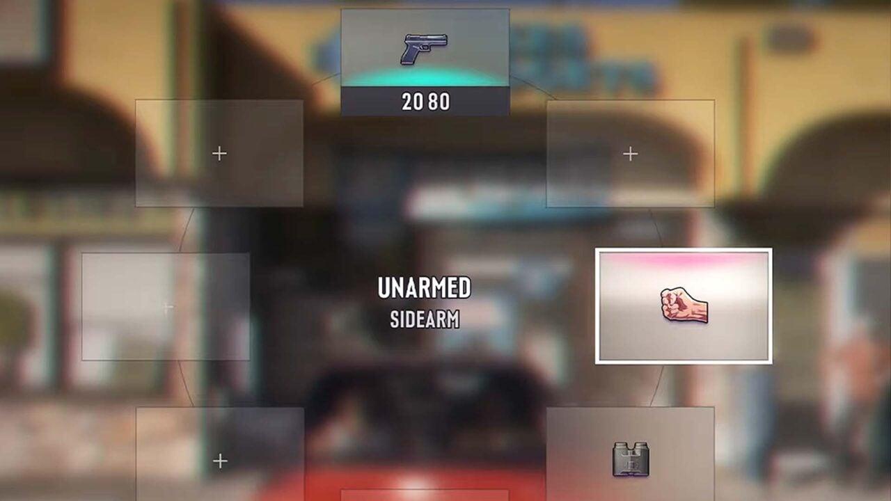
Grand Theft Auto 6 GTA 6 Rockstar Games UI
Yesterday, the world got its first (official) look at Grand Theft Auto 6 gameplay via a nearly 30-minute-long trailer. And while reactions to the GTA 6 Extended Look video were mostly positive online, the games user interface has become the focus of online debate. Some people say it looks bad. Some like how simple it looks. And a few others are hopeful it might change before launch.
In the hours after the big GTA 6 gameplay reveal went live on Netflix, and then later on YouTube, GTA fans have been picking apart every frame for information. And one detail pulled out of the gameplay trailer has become a fierce online debate: GTA 6s UI. Specifically, some people arent fans of the weapon and item wheel interfaces, which feature colorful icons representing guns, melee weapons, healing items, and pieces of clothing. You can find posts on Twitter, Reddit, and elsewhere of people sharing screenshots of GTA 6 s UI alongside negative reactions or disappointed comments.
I don’t like the HUD so far. The minimap looks good, but I’m not especially keen on the weapon wheel, posted GTA content creator Ben Videotech on Twitter . I think they need to go back to the drawing board on this.
Hot Take: GTA 6 needs to fix this simplistic UI, posted The GTA Assassin. It lacks character, and looks undercooked. Rest of the game looks peak.
Yeah, the UI is by far my weakest point, said Gameroll on Twitter . I’m not gonna criticise the GPS too much because I imagine it will be somewhat customisable, but the rest of the HUD is sort of just serviceable at best. It’s simple and easy to understand, and it will be good functionality-wise, but it’s really boring and lacking much of a personality IMO.
A post on Reddit simply says UI needs some work and has over 500 upvotes and plenty of people in the comments who agree, calling GTA 6 s UI too minimalist, simple, and boring.
I think most of it will grow on me, said one user on Reddit in response to the post complaining about the UI. But I really dislike the look of the health and focus bars. I feel like the minimalist approach has sucked the life out of those in particular. The weapon wheel being circular, but made up of rectangles is also a bit odd to me, but overall it looks nice.
Yes, posted another user. Its the only thing in the entire trailer that didnt particularly blow me away. Well see, maybe they still have UI things to refine. Its not bad, it just seems a little basic to me.
ui needs some work by u/juice_vvrld in GTA6
Over on the PC Master Race (bleh) subreddit, a post pointing out that a lot of fans defended the simple UI seen in the leaks as being unfinished has racked up over 3,000 upvotes and has a lot of people in the comments below it joking about how a massively expensive game like GTA 6 that has been in development for so long is going to ship with such a bland user interface.
Another popular post on Reddit and social media shows what the GTA 6 UI looks like with rounded corners. The general reaction from people online to this fan tweak is that while it doesnt fix all of the issues they have with the UI, it does make it look better and more finished.
Of course, there are plenty of GTA fans defending the minimal UI and colorful icons, with some suggesting Rockstar is trying to keep things simple so people can focus on the game, and others claiming that, with the exception of Red Dead Redemption 2, Rockstar has always used simple, sleek user interfaces and menus.
I don’t prefer visually beautiful HUD, I don’t wanna get distracted by it, said one fan on Twitter in response to a negative post about the UI.
I like it, it keeps the game-y feel of GTA, posted another user on Reddit. Someone replied to that comment with: I personally like it too. Looks modern and matches the Vice City look. Later, another fan concurred: I think it looks fantastic and dont mind the simplicity.
I agree, the little icons for each object is really steam/indie-like and I mean that in the best way, suggested another user on Reddit. The devs know what they’re going for and I’m all for it.
It looks good to me. I don’t get why people are so upset with it, just a normal minimalistic Ui with very nice object art, added a fan of the UI.
There are also a lot of people suggesting that perhaps the UI will change drastically between now and release. To those people, I have bad news. Historically, when Rockstar shows UI elements in gameplay trailers, not much changes. A good example of this can be found in the first Grand Theft Auto V gameplay trailer. It shows the weapon wheel, and when compared to the weapon wheel as it appeared in the first version of the game on Xbox 360 and PS3, not much has changed beyond a colored filter added behind the UI.
So while it is technically possible that Rockstar could make some big changes to the weapon wheel icons and shape, I think this is probably the UI that will ship with GTA 6 in November. And for some fans, thats fine as long as Rockstar doesnt delay GTA 6 again and make them wait even longer to play it.
Don’t make them delay it bro, posted RockStation on Twitter.
🕹️ Level up your inbox
Don’t miss the latest reviews, news and tips. Sign up for our free newsletter.
For The First Time In 25+ Years, GTA 6 Will Make Stealing Cars Hard
Committing grand theft auto in Grand Theft Auto 6 will be much more challenging and rewarding
You Can Pet The Dog In GTA 6 And Also Throw Its Poop At NPCs
It can also apparently help you win the lottery?
Fans Think Theyve Spotted GTA 6 s First Returning Character And It Shows The Leap In Graphics From GTA 5
You probably don't remember her from GTA Online